Making system state visible in AI course creation
DURATION
12 weeks
TEAM
Lanting K, Claire P, Jeffery Y, Aswathi T
CLIENT
Gutenberg Technology
SERVICE
UX Research, Product Design
TOOLS
Figma, Tobii, Hot Jar
Long Story Short
Gutenberg’s AI Course Builder converts PDFs, PowerPoint files, and other documents into structured courses. AI-generated results are non-deterministic, but the system does not clearly communicate what users should provide or what will happen next. As a result, participants feel stuck, hesitate to take action, and rely on trial and error.
In this project, I studied how participants interact with the system and redesigned how the system communicates its behavior.

Problem
Participants hesitate and move back and forth throughout the workflow
Participants frequently hesitate before taking action, revisit the same input fields, and move back and forth between sections. Some skip steps entirely. These patterns appear throughout the flow, from creating a project to generating content.
Input Purpose
Participants repeatedly revisiting input fields
Action Outcome
6/8 participants hesitated before generating content, unsure how it would affect existing content
System Status
Participants were unsure if their work was saved
Research
Understanding why users feel uncertain when interacting with AI system
8 Eye-Tracking + RTA Sessions
Conducted 8 in-person eye-tracking sessions with first-time users, paired with retrospective think-aloud (RTA) to understand how they made decisions and where confusion happened during tasks.
61.3 System Usability Scale (SUS) score
Participants completed the System Usability Scale (SUS) after each session. The product scored 61.3, suggesting that users didn’t feel fully comfortable using it.
Same Patterns were found in Hotjar
Hotjar revealed the same interaction patterns, verifying where existing users hesitated, retried actions, or tried to figure out what to do next.
Core Insight
System state is not visible to participants
The AI course builder generates draft based on user input, and detailed editing is expected to happen later in the CMS. Watching participants go through the process, I found they were stuck during several steps. These issues have some common areas.The system state is not visible, which causes confusion throughout the process. Participants don’t know what to provide or what will happen next, so they rely on trial and error.
Step 01
Set up course input
1
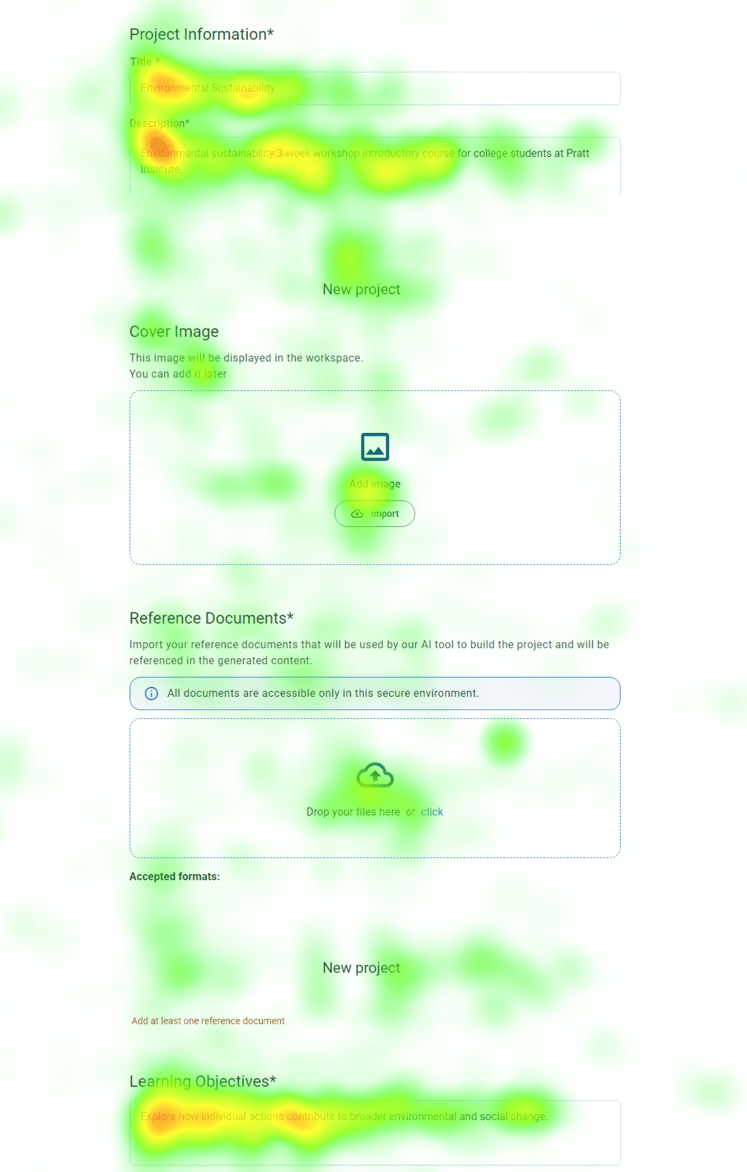
Confusion Between Description and Learning Objectives Fields
Participants struggled to differentiate between the “Description” and “Learning Objectives” fields. In gaze replay, users repeatedly copied text between the two, indicating uncertainty about what each field required. This hesitation slowed down their progress.
Heatmap data further supports this, showing heavy fixation on both fields as participants spent additional time trying to determine what content belonged in each one.
Step 02
Generate course outline
2
Step 03
Review & Refine course outline
3
Uncertainty Around Saved Work
After generating pages of content, 4/8 participants were confused by the wording of the “Update Information” button. They weren’t sure if their work was saved, which made them hesitate and lowered their confidence in the system.
Step 04
Generate course content
4
Step 05
Review & Refine content
5
Design Decision
Set clear expectations for users
It’s like being asked to draw something without knowing what is expected. Most people don’t feel stuck because they lack creativity, but because they don’t know what to draw. If you ask them to draw a blue flower, they can easily do it. Existing Course Builder AI creates a similar experience. Participants are given input fields, but it’s unclear what kind of information they should provide or how it will be used. They feel stuck and frustrated when facing a blank input space.
To address this, I added four types of information to support participants while filling out the form, helping them better understand each field and reducing cognitive load.

01 - Indicate Purpose
What are they filling out right now?
02 - Length Guidance
How much should they write?
03 -Content Guidance
What kind of information should they put here?
04 - AI Transparency
How will this affect the generated course?
Support safe iteration
Looking for a save option and feeling hesitant to click the regenerate button signals a need to keep existing content. The current system behaves like a chatbot, where regenerating content overwrites previous results unless users create another project. Because AI is non-deterministic, the same input does not guarantee the same output, making previous content important as a reference.
To solve this, I ensured that user progress is preserved through version history and auto-save, and made this visible through notifications so users know their work is safe before taking action.

01 - User Awareness
Let users know system status
02 - Version History
Allow users to return to a previous point
Impact
“We were taking notes the whole time. This was really helpful.”- GT Course Builder AI Product Manager
Conclusion
From Usability Issues to System Visibility
Triangulating multiple data sources helped validate consistent patterns in user behavior. By combining eye-tracking, RTA, and behavioral data, I was able to identify reasons behind hesitation and confusion, rather than relying on a single signal. This shifted the focus from isolated usability issues to a broader problem of system visibility, where users were unsure what would happen next and hesitated to take action.
However, testing was conducted in isolation without full CMS context, which may influence how users behave in real workflows. Future work would validate these findings in a CMS-integrated environment and explore how different interaction models support both generation and editing.

